
Color Logic for Activewear: Building a Palette That Closes
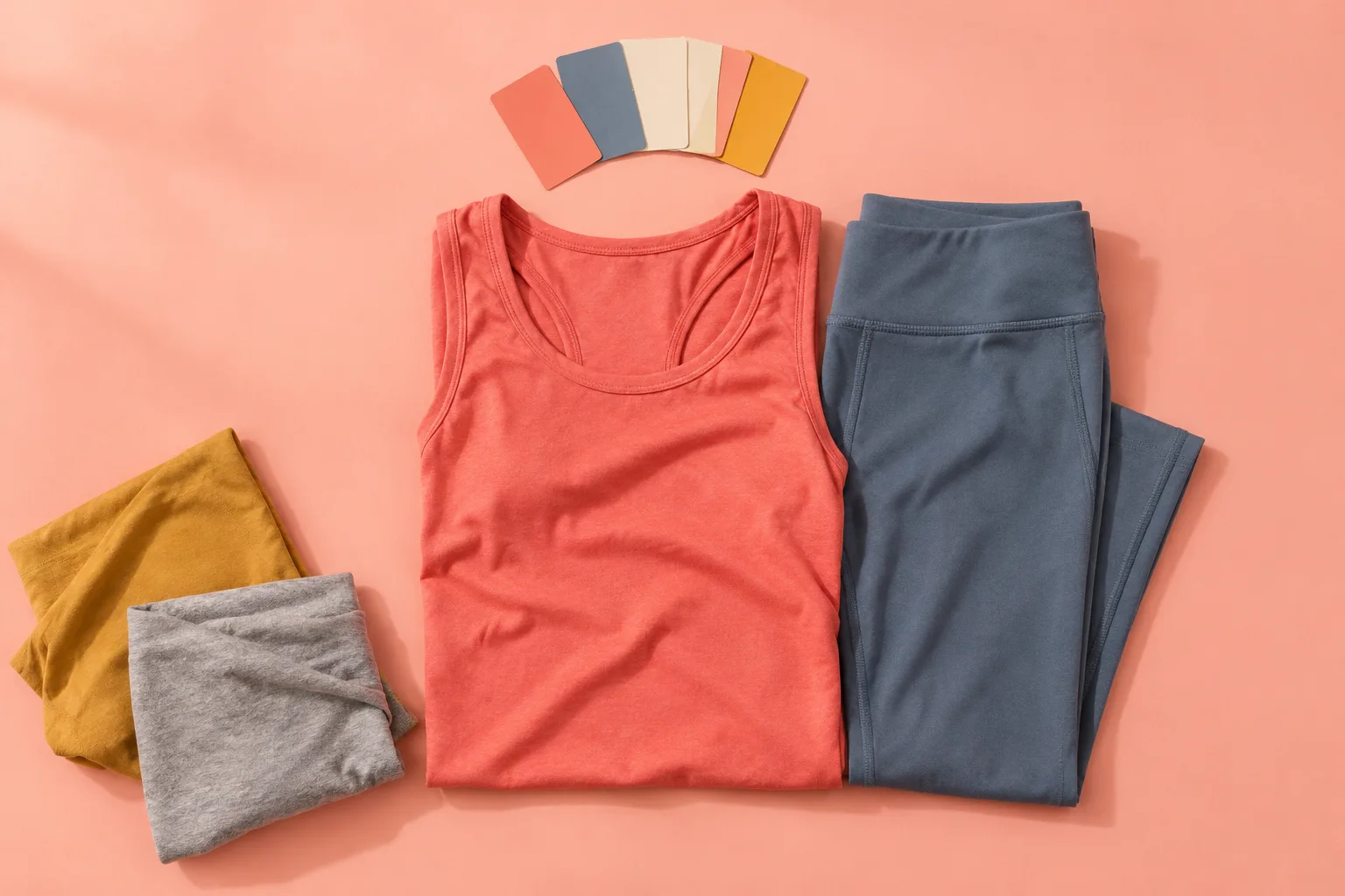
Most activewear palettes fail at the same seam: the top and the bottom were chosen separately, in different lights, with different intentions. A coral tank bought on a bright Saturday, a slate legging bought on a gray Tuesday, and by the time they meet in a gym bag they argue. The outfit closes only when the person wearing it stops thinking about it. That closure is the whole job of a color plan, and it is almost never planned.
Color logic for activewear is a narrower discipline than color theory generally. The clothes move, they sweat, they stretch across the body, they get photographed under fluorescent light at 6 a.m. and sodium light at 9 p.m. A palette that closes has to survive all of that, plus the wearer's own skin tone, plus the fact that a sports bra and a pair of shorts are often the only two decisions made in a dark room before dawn.
Why gym lighting rewrites every swatch
A fabric swatch viewed at a kitchen window is not the garment. Retail floors run warm, around 3000 to 3500 kelvin, which flatters almost everything and makes burgundy look richer than it is. Gym floors run cooler, often 4000 to 5000 kelvin, and cool light pulls the red out of a fabric and leaves the blue. A brick-colored crop top that looks expensive in the store can read as dusty brown under overhead LEDs.
This is the first hard rule of the discipline: judge a palette under the light where it will be worn, or at least accept that the store is lying by a few hundred kelvin. Photograph the pieces together on a phone at the gym before committing. The camera exaggerates what the eye forgives, which makes it a useful liar.
There is a second light problem, and it is the wearer. Skin has an undertone, and activewear sits directly against it at the neckline, the shoulders, the ankles. A color that closes beautifully on a hanger can go muddy against a warm olive forearm or chalky against cool pink skin. The palette is not the clothes alone. It is the clothes against a body under a specific bulb.
The two-color floor and why it works
The most reliable structure in activewear is two colors plus a neutral, and the neutral does most of the quiet work. Black is the obvious neutral and the least interesting. Charcoal, warm gray, and a deep navy do the same job with more depth and less of the "I gave up" signal that all-black kit sometimes sends.
Two colors, though, need a relationship. They can agree in temperature (a rust top with an olive short, both warm, both muted) or they can sit across the wheel at low saturation (a dusty teal with a faded clay). They should not compete in brightness. One color carries the eye, the other supports it. A neon lime short and a hot pink bra is a palette that closes only if the wearer wants to be seen from across the parking lot, which is a legitimate goal but a different one.
The neutral is the floor. It gives the other two colors something to stand on and it absorbs the chaos of a jacket, a water bottle, a pair of shoes that were never part of the plan. A palette without a floor tends to look like a sale rack even when every piece was chosen carefully.
Saturation is the real variable, not hue
People talk about color as if the name of the hue were the decision. It is not. The decision is saturation, and saturation is where activewear palettes live or die. Two garments in the same hue at different saturation levels will fight harder than two different hues at matched saturation. A vivid cobalt legging and a washed denim-blue tank are technically relatives and practically strangers.
Matched saturation is the quiet trick behind palettes that look intentional without looking matched. A dusty rose bra and a sage short share a muted quality; they read as a set even though no one would call them the same color. A saturated forest green and a saturated plum do the same at the other end. The eye reads the shared intensity before it reads the hue, which is why "I can't explain it, it just works" is usually a saturation match.
This also explains the classic failure: a bright technical fabric next to a soft cotton-blend piece. The materials have different sheens, and sheen changes apparent saturation. A matte legging and a shiny top in the same color will not close. The top reads louder. Buy the shine and the matte in deliberately different colors, or skip the shine.
Skin tone, sweat, and the colors that survive both
Activewear has a problem that streetwear does not: it gets wet, and wet fabric darkens. A pale gray short that looks crisp dry turns translucent and blotchy the moment it is soaked, and the color it becomes is not the color that was chosen. Deep colors and mid-tones hide sweat far better than pastels. This is not a moral point about modesty; it is a practical one about a palette holding its shape through a workout.
Skin tone interacts with this. Warm undertones tend to pull toward earth tones, rust, olive, mustard, and terracotta, and those colors also happen to hide sweat well. Cool undertones sit comfortably in slate, berry, deep teal, and true navy. The overlap zone, the colors that flatter almost everyone, is small and useful: charcoal, deep burgundy, forest green, and a clean black. A palette built from that overlap is boring only if it never gets a third color.
Building the palette as a wardrobe, not an outfit
The mistake almost everyone makes is planning single outfits. The better move is planning a small system where every top can meet every bottom and nothing clashes. That is a combinatorics problem dressed as a color problem, and it changes what gets bought.
Choose three neutrals as the base: one dark (black, charcoal, or navy), one mid (warm gray, taupe, or olive), one light (bone, oatmeal, or a soft off-white, kept for tops where staining is less likely). Then add two accent colors that share a temperature and a saturation level. Six pieces in this system produce more wearable combinations than twelve pieces bought as separate outfits.
The accents should be chosen last and chosen together. If the first accent is a burnt orange, the second should be something that agrees with burnt orange at the same muted intensity: a deep teal, a rust-adjacent clay, a warm plum. If the first accent is a cool cobalt, the second goes cool and clean, a slate or an ice blue. Accents chosen one at a time, months apart, almost always miss each other.
Where pattern earns its place in a working kit
Pattern in activewear is usually camouflage: heathers, marls, small geometric prints, a camo short, a tie-dye legging. Most of it is noise, but one patterned piece can hold together a palette that is otherwise too flat. The rule is that the pattern should contain the palette's colors, not introduce new ones. A marl tee that mixes the neutral and one accent is doing structural work. A loud print that brings three new colors is a separate outfit pretending to be part of the system.
Heathers deserve their own note. A heather gray or a marled fabric is already two colors blended, which means it can bridge a palette gap that a flat color cannot. When two solid colors refuse to close, a heather in the middle range often solves it. This is a small, unglamorous trick and it works more often than most people expect.
The closing move: one piece that is slightly off
A palette that closes perfectly can feel dead. The best kits leave one piece slightly off the plan, a sock in a color that echoes nothing, a cap in a shade one step warmer than the rest. The tension is what makes the outfit look like a person chose it rather than a brand styled it. The trick is that the off piece must be small and it must share either temperature or saturation with the palette, never both and never neither.
There is also a hard constraint that color logic has to respect: a workout kit has to survive being thrown in a bag, washed at 40 degrees with everything else, and worn again before it has fully dried. Colors that bleed, colors that fade unevenly, and colors that pit against each other in the wash will not hold a palette together no matter how well they were chosen on the rack. Deep and mid-tone colors in similar dye classes last longer as a set than a mix of pastels and neons, which fade at different rates and drift apart over a season.
What actually closes a palette is repetition under pressure. A person who owns a charcoal short, an olive short, a bone tank, a rust long-sleeve, and a deep teal crop can dress in the dark, grab any two, and walk out looking deliberate. That is the test. Not whether the outfit photographs well on a hanger, but whether it survives a 5:45 a.m. decision made by a half-awake body reaching into a drawer. A palette that passes that test is doing its job, and the person wearing it will never once think about color theory while it happens.